Exploring Earthquake Clusters with Python
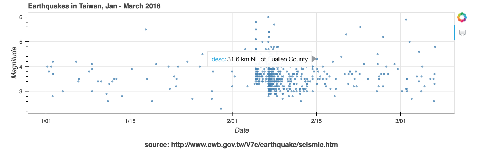
I’m currently traveling around Taiwan. Before I arrived, I saw reports of numerous 5.0+ earthquakes hitting the Hualien area. I did a bit of digging into Taiwan’s open earthquake reports to figure out if it was still risky to travel in that area.
Getting Data
Taiwan’s earthquake data is available on Taiwan’s Central Weather Bureau site by month via HTML tables. I used the Selenium Python package to “click” through the site and load January, February, and March’s tables. Beautiful Soup, an XML parsing library, let me extract data values for each earthquake from the HTML tables.
# function to extract earthquake data from HTML table row
def find_earthquakes(soup):
    earthquakes = []
    for tr in soup.find_all("tr")[1::]:
        content = tr.find_all("a")
        if len(content) > 1:
            ts = arrow.get(content[1].text, tzinfo="+0800")
            lon = float(content[2].text)
            lat = float(content[3].text)
            mag = float(content[4].text)
            desc = content[6].text
            earthquakes.append([ts, lon, lat, mag, desc[1::]])
    return earthquakes

# Get earthquake data for Jan, Feb, March
select_months = ["1", "2", "3"]
all_earthquakes = []

driver = webdriver.PhantomJS()
driver.get("https://scweb.cwb.gov.tw/Page.aspx?ItemId=26&loc=en&gis=n")

for month in select_months:
    # Find the "select" element that lets us choose a month
    select = Select(driver.find_element_by_id("ctl03_ddlMonth"))
    select.select_by_visible_text(month)

    # Choose a month, click the button, and load the month's data
    sbtn = driver.find_element_by_id("ctl03_btnSearch")
    sbtn.click()

    # Parse the HTML table using BeautifulSoup
    soup = BeautifulSoup(driver.page_source, "html5lib")
    all_earthquakes += find_earthquakes(soup)
The code above turned multiple HTML pages into a Python list. Now we can start visualizing!
Visualizing
I wanted to see the frequency and magnitude of the earthquakes in one chart, so I plotted earthquakes using a scatterplot, with the X axis representing time of occurrence and Y axis representing magnitude. While I usually use matplotlib for visualization in Python, I chose Bokeh this time, which provides interactive chart elements out of the box.
Here’s the code used to generate the scatterplot.
import bokeh
from bokeh.plotting import figure, show
from bokeh.models import Title, ColumnDataSource, HoverTool

x = list(map(lambda z: z[0].datetime, all_earthquakes))
y = list(map(lambda z: z[3], all_earthquakes))
desc = list(map(lambda z: z[4], all_earthquakes))

ds = ColumnDataSource({
    "x": x,
    "y": y,
    "desc": desc
})

hover = HoverTool(tooltips=[ # Creating tooltip format
        ("location", "@desc"),
        ("mag", "@y")
    ])

# Figure takes the title, axis definitions, size, and tooltip object
fig = figure(title="Earthquakes in Taiwan, Jan - March 2018", x_axis_type='datetime',
             plot_width=900, plot_height=300, tools=[hover])
fig.add_layout(Title(text="source: http://www.cwb.gov.tw/V7e/earthquake/seismic.htm", align="center"), "below")

# Setting axis labels
fig.yaxis.axis_label = "Magnitude"
fig.xaxis.axis_label = "Date"

# Drawing individual circles for each earthquake
fig.circle("x", "y", source=ds, size=3, color="steelblue", alpha=0.7)

# Showing the plot
show(p)
Some things to note:
ColumnDataSource
ColumnDataSource is a data structure used by Bokeh that maps names to sequences (Python lists, numpy arrays, Pandas series).
In this case, we called our “x” and “y” lists in our ColumnDataSource object x and y, respectively, and we added another column called desc that contains a text description
of each earthquake.
The desc list is used for our tooltips (the HoverTool object).
This structure keeps all of the attributes to our data in one place.
Tooltips
Tooltip functionality is built into Bokeh, and it’s one of my favorite things about this library.
I can format what my tooltips will look like by creating a HoverTool object and passing it
to my figure.
Check out the HoverTool documentation
to learn more about tooltip formatting.
fig.circle
Rather than pass our ColumnDataSource directly to a scatterplot function, we call Bokeh’s
circle method and pass in our
ColumnDataSource with the column names of our x and y values.
Bokeh comes with other shapes, like square, diamond, cross, and so on.
This is handy if we want to plot some values with different shapes and/or colors.
Thoughts
According to the graph I made above, the earthquake swarm ended right before I landed. I should also say that Earthquakes aren’t easy to predict for scientists who are much much much much more educated about this topic than I am and this chart shouldn’t be used for any life-or-death earthquake-related emergency. My goal was to visualize the frequency of earthquakes to get a better understanding of the trend of their occurrences. It was a cool feeling to be able to see the swarm of earthquakes in the chart I made and understand how a large earthquake can trigegr a lot of these strong aftershocks.
Gathering and visualizing all this data took me a relatively short amount of time to do, and it felt satisfying to answer my own question using open source visualization tools that are accessible to anyone who can run Python on their machine.
I have this notebook up on GitHub and encourage you to play with it yourself. What kind of questions can you answer using these tools?