thoughtbot 2014 report
I was inspired by beautiful end-of-year reports I saw other companies release in December/January, detailing the important stats of their company. In 2013, I created an internal "report" during thoughtbot's that created amusing stats about our company's chat habits. I wanted to create something public in 2014.
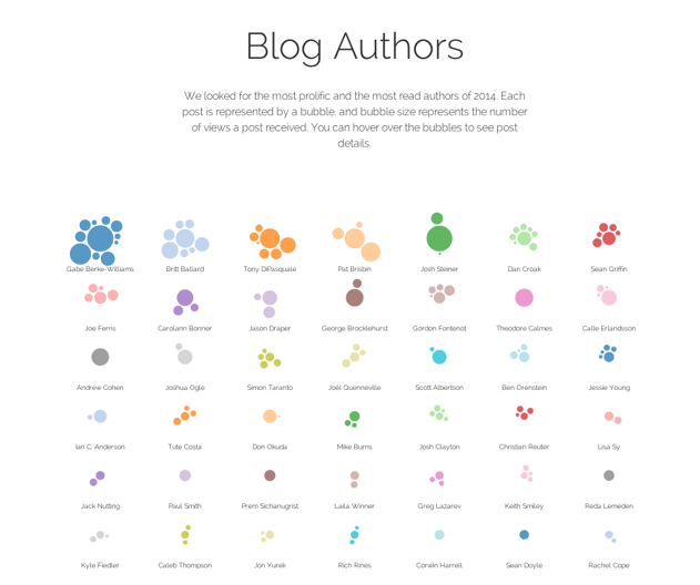
I worked on a team with coworkers Joel and Gabe, who helped collect data about our blog post content. I wanted to show our most popular blog posts that year in a creative way and designed the visualization below.

Each circle represents a blog post, the size of the circle represents the number of views the post got. The posts are all grouped by author. I was surprised that our most popular blog posts were about our testing practices, command line tools like sed and awk, and our git workflow. These are tools and practices that I didn't think needed explanations because were so ingrained into my workflow, but I was definitely wrong!
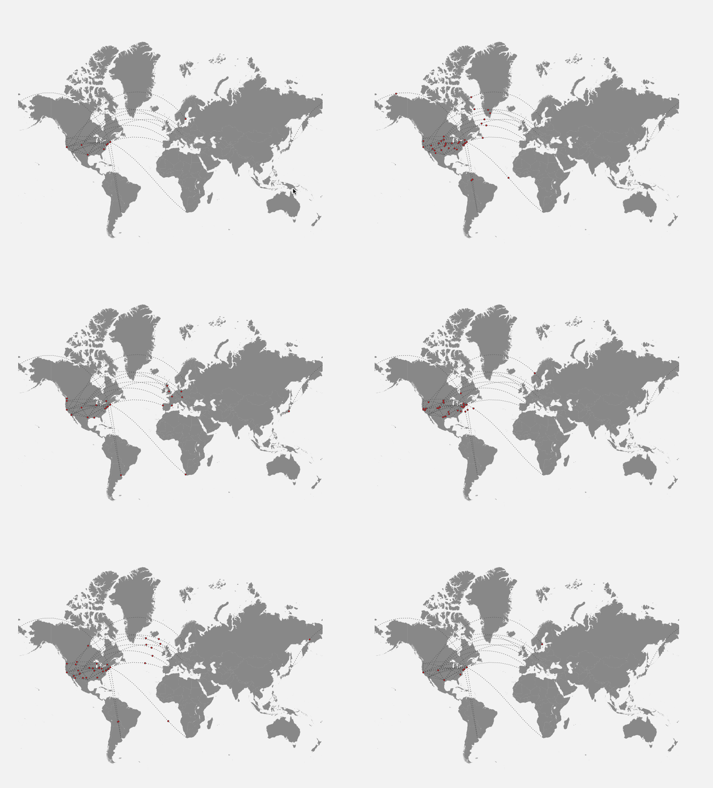
I was also proud of the D3.js animation I made showing the distances traveled by our employees to give conference talks. The starting location is each speaker's home office location, the ending location is the city of the conference.

The original report is no longer hosted on the thoughtbot site, but you can view an archived version .