Recreating Richmond Inequality Map in QGIS, Part 1
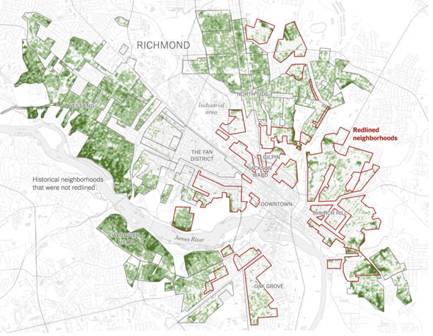
In 2020, the New York Times released an article detailing the effects of redlining on the neighborhoods of Richmond, VA (my current city of residence). Redlining refers to the classification of neighborhoods that were “risky investments” by the US government. In the 1930s, the Home Owners’ Loan Corporation, a US government agency, assigned categories to neighborhoods to determine which were “worthy” of government-assisted home ownership programs. Redlined neighborhoods, or neighborhoods assigned a “D”, were considered risky investments by the government and did not qualify for assistance. Most of these neighborhoods were where Black residents lived.
Today, nearly a century later, these same redlined neighborhoods are feeling the effects of these categorizations in regards to climate change. These neighborhoods are generally a lot hotter than the not-redlined ones, and this will only get worse with the rising temperatures and unstable weather caused by climate change. To show the effects of redlining in Richmond, NYTimes visualized the tree cover, surface temperature, and paved areas of these neighborhoods in the article. I wanted to recreate the visualizations they created using open source tools and data, mostly with QGIS and share the steps I used to recreate it through a series of posts.
The original map
This post will guide us through creating this map in QGIS. This tutorial is aimed at QGIS beginners but requires basic knowledge about geographic file types and Python.
We’ll work on displaying the following:
- The baselayer map
- The Home Owners’ Loan Corporation neighborhood classifications, highlighting the redlined neighborhoods
- Treecover in those neighborhoods
More treecover means cooler surface temperatures. In the map above, you can see that the redlined neighborhoods have less treecover (less green).
Requirements
Install
Data
- Neighborhood categories - Search for “Richmond” and download
Shapefile - Tree Cover - Download 2016’s data
Adding and Styling a basemap
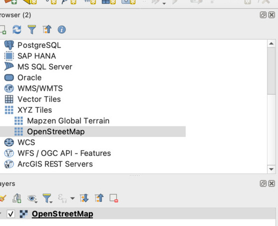
Open QGIS, and open the XYZ Tiles dropdown in the QGIS browser panel.
Add OpenStreetMap tiles to your map by double clicking it or dragging it to your project layers.
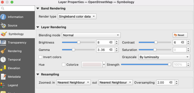
The NYTimes uses a black and white, washed out basemap in their map to make sure that it doesn’t distract from the data on top of it. We’ll style ours to look similar.
Double click on the OpenStreetMap layer in the layer panel
and then go to the Symbology tab.
I set the map style by setting Grayscale to By luminosity and playing with the contrast, brightness, and gamma values to get the effect I wanted.
You can play around and set your own numbers (especially if you understand color theory better than I do).
Here are the values I used:
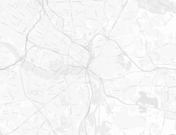
The result:
Optional: I created a spatial bookmark for Richmond, VA to help me while working on this project. This lets me quickly go back to my map’s location and zoom level while I’m working.
Render Neighborhoods in Richmond
We want to display the neighborhoods defined in the Home Owners’ Loan Corporation document and highlight the redlined neighborhoods, or the neighborhoods with a D categorization.
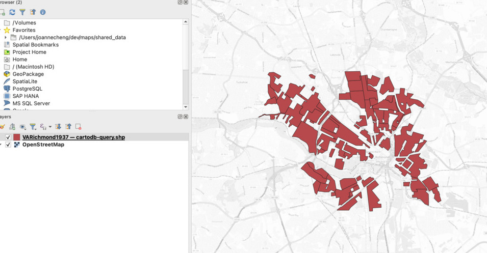
Search for “Richmond” in the Mapping Inequality site and download the Shapefile.
After you download the shapefile, you can add it to QGIS by dragging the zip file to the project, or using the Layer menu item (Layer -> Add Layer -> Add Vector Layer).
If everything worked correctly, you should see the layers rendered on your map with solid, outlined shapes like so:
We want these shapes to be outlines instead of filled-in shapes, and we want the redlined neighborhoods to be outlined in red.
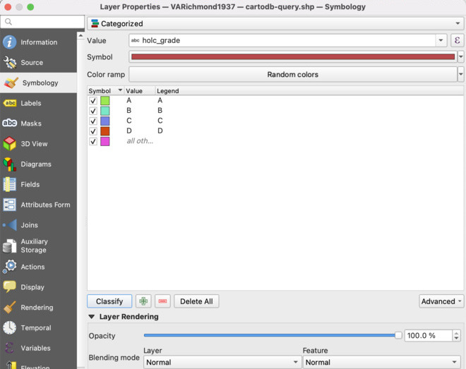
- Double click on the layer in the
Layerswindow and click onSymbologyon the left hand side of thePropertiespopup. - Click the top dropdown where it says
Single Symboland change it toCategorized. - We need to select the field we want to categorize on. Using the
valueinput right below that top dropdown, select (or type in)holc_gradeand then click theClassifybutton. - Keep the
A,B,C, andDcategories, but delete the last uncategorized one.
Style the categories by double clicking on the entry in the table and editing the settings.
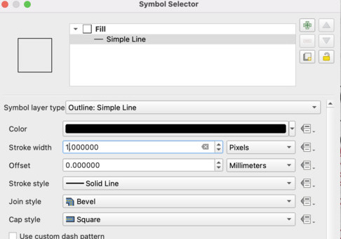
You can use the Save Symbol button to save this outline style and apply it to the other neighborhoods to save yourself some clicks.
The D neighborhoods are our redlined areas.
We want these neighborhoods to be outlined in red instead of black (I used rgb(153, 0, 18)).
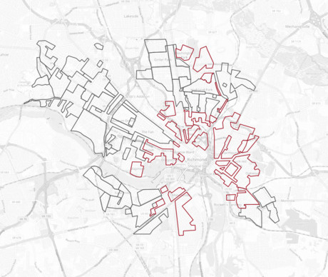
Save your styles by clicking OK. You should have something that looks like this:
Next, we’ll work on displaying tree cover data.
Prepare Tree Cover Data
The Multi-Resolution Land Characteristics (MRLC) consortium provides Tree Canopy Cover data for the continential US (CONUS) from 2011 - 2021 as raster files (geotiff).
The NYTimes article uses data from 2016, so let’s download that year’s dataset to stay consistent.
Once you’ve downloaded the files, you might have noticed two things:
- The data is for CONUS, but we just need the data for the neighborhoods defined by the shapefile we displayed in the step above.
- This file very, very large (several GBs).
I used Python to clip the raster file against the shapefile we used in the previous section. There’s a way to do this in QGIS itself, but I prefer Python because I can easily run this script as many times as I need to, instead of making repetitive clicks on a UI.
Since this is a QGIS tutorial and not a Python tutorial, I won’t go into depth of how the script works. You can copy it and edit it so the file locations match the files on your computer. Make sure you have rasterio and geopandas installed.
import rasterio
from rasterio.mask import mask
import geopandas as gpd

geotiff_file = "nlcd_tcc_conus_2016_v2021-4.tif"
# geotiff_file = "your/file/location/nlcd_tcc_conus_2016_v2021.tif"
shapefile = "./VARichmond1937/cartodb-query.shp" # Unzipped shapefile of Richmond's neighborhood rankings
# geotiff_file = "your/file/location/VARichmond1937/cartodb-query.shp"
clipped = "clipped_treecover.tif"

vec = gpd.read_file(shapefile)

with rasterio.open(geotiff_file) as tif:
    vec_newcrs = vec.to_crs(tif.crs)
    out_img, out_transform = mask(tif, vec_newcrs.geometry, crop=True)
    out_meta = tif.meta.copy()

out_meta.update({
    "driver": "Gtiff",
    "height": out_img.shape[1],
    "width": out_img.shape[2],
    "transform": out_transform
})

with rasterio.open(clipped, 'w', **out_meta) as dst:
    dst.write(out_img)
You should have a new file called clipped_treecover.tif that is a lot smaller than the original treecover raster file.
Render Tree Cover Data
Add clipped_treecover.tif to your project, either by dragging the file to QGIS or using the QGIS menu (Layer -> Add Layer -> Add Raster Layer).
There should be a new layer in your project that looks something like this:
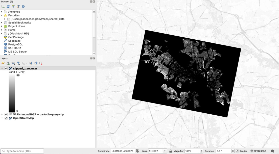
We can make this layer look like the NYTimes version by changing a few style attributes.
- Double click the
clipped_treecoverlayer and go toSymbology. - Select the
Singleband Pseudocolorrender type - Add a category and set the value to
0. Set that category’s color to have0opacity. This will get rid of the black box around our data - if we don’t have any trees at a certain point, then we won’t display anything. - Edit the categories so it looks like the following.
I used white for my
1value with a little opacity for style, andrgb( 49, 99, 12 )for my value at 98, which is the max value in my raster file.
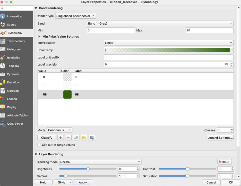
Save your style by clicking OK.
Final Result
Here’s our final result:
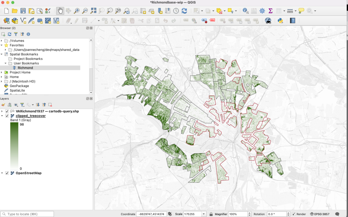
In future posts, I’d like to share how to add more layers to display paved surfaces, summer temperatures, and labels. I’d like also explore ways to share this map in the browser.
Sources
Robert K. Nelson, LaDale Winling, Richard Marciano, Nathan Connolly, et al., “Mapping Inequality,” American Panorama, ed. Robert K. Nelson and Edward L. Ayers, accessed August 12, 2023, https://dsl.richmond.edu/panorama/redlining.