Every Building in Denver
I was inspired by the Map of Every Building by the NY Times this a few weeks ago and decided to use the city of Denver’s Building Outlines Dataset to create a map of every building specifically for Denver.
Because I had a bit more metadata on the building outlines, I used QGis to create a map that colored different buildings based on their building type.
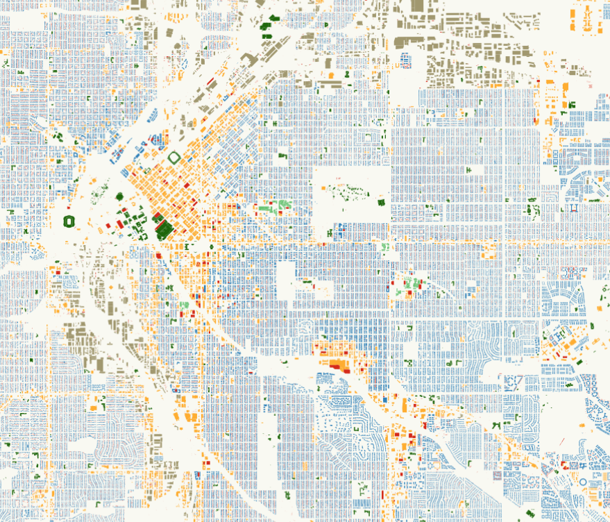
The building outlines dataset has metadata on building type: residential, commercial, public, etc. I used QGis to load the shapefile included in the building datasets and defined each building type with a different color.
Using the QTile Plugin, I was able to export my map to a browser-presentable slippy map. The QTile plugin created all my map tiles and a simple HTML/JavaScript snippet to view and interact with my map. The final result can be seen here.
Zooming and panning the map around led to some interesting observations about Denver:
Visible Arteries
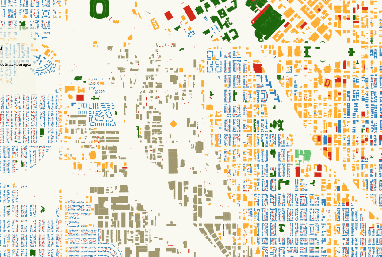
I-25 snakes through the city like a giant river. Commercial buildings (yellow) line the edges of major roads, such as Speer Boulevard and 6th Avenue. South of downtown, the major industrial parks (brown) are clustered together.
Neighborhood Shapes
 |
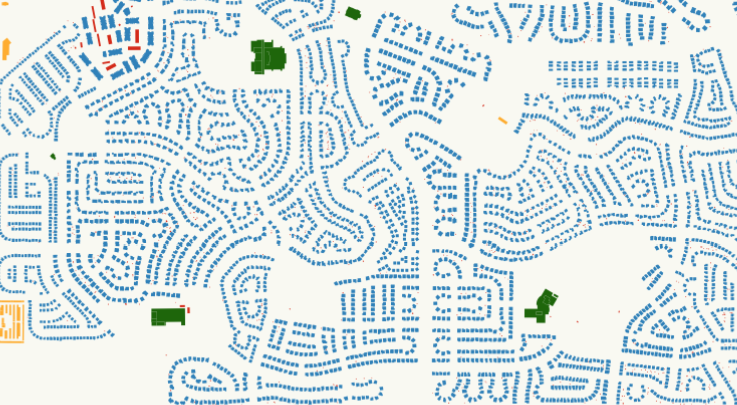 |
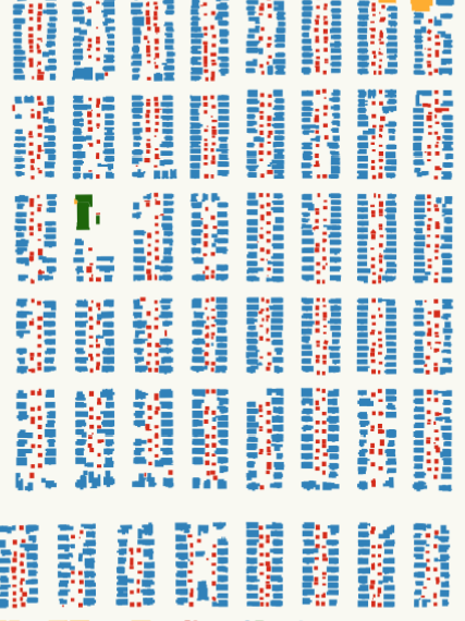
Older Denver residential neighborhoods, shown in blue, are laid out like a grid. Nearly all of them are in small lots with sheds or garages in the back, as indicated in red. Compare this with newer affluent neighborhoods, such as Stapleton. Stapleton homes are larger and laid out with more space separating the homes, without detached garages. From the map, you can see winding cul-de-sacs, rather than the more space-efficient grid structure.
Thoughts
This was a relatively quick weekend project that resulted in a way to let me see Denver in a different light. Play with the map yourself and try to find more interesting patterns, or dig into Denver’s Open Data Portal and explore Denver on your own!